Showing posts with label art. Show all posts

Monday, April 18, 2011

this video will never get old

Take four minutes and watch this.
“The world is not respectable; it is mortal, tormented, confused, deluded forever; but it is shot through with beauty, with love, with glints of courage and laughter; and in these, the spirit blooms.” - George Santayana

Tuesday, April 12, 2011

photographic inspiration from Cartier-Bresson

There is a captivating Cartier-Bresson exhibit on display at the High. I didn't know who he was before the exhibit, but I found his work enchanting and very real. As the wall tells you when you walk into the gallery,
... each frames a small group of characters in a scene of stunning simplicity.
French Quarter, New Orleans, Louisiana. A simple green door and a captivating shot.
One of my one-year reflections for the blog was that I need to take more of my pictures. I recently bought a new camera (and I highly recommend it, if you're looking for a point-and-shoot). I'm not a serious photographer, but this camera makes me feel like I could be.

Cartier-Bresson strove to capture life and people in the process of living. This is the definition of ethnography, and one of my favorite parts of being a designer.
Playing Holi with friends and family.
On the bridge to the Stent Wing at the High.
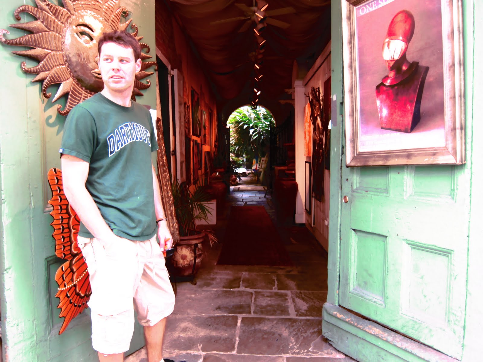
Thomas looking artsy outside of an art gallery in the French Quarter, New Orleans.
It is through "living that we discover ourselves, at the same time as we discover the world around us."

Monday, April 11, 2011

the new rules for design & science

A bit ago, Tim Brown from IDEO wrote a post called "Design Renews its Relationship With Science."
My own view is that the latter half of the twentieth century saw a steady decline in designs interest toward science and technology as engineering inserted itself between the two. This is not a criticism of engineers who, in places like silicon valley, performed wonders with the new technologies of micro-processors, storage, networking and software to create the products and services we rely on today. The same is true in other fields such as aeronautics and bio-medicine. No, my criticism is of the designers and scientists who have relied on engineers to provide the translation between their two fields. My concern is that in this translation much is lost that could benefit scientists, designers and the end user.
I think "design" has gotten clique-ish. We hear the term designer and we think artsy, creative types who hang out in art museums and doodle in their margins. We've mistaken creativity for quirky stereotypes.

I saw a friend of mine last week at the Cherokee Club who is a designer by training, and he remarked that he didn't know I "design." And it's true: I have no background in graphic design, I've never taken a course on fabrication, I like my margins neat and doodle-free, and although I like museums of all sorts, I have no appreciable ability in sketching or drawing (well, I can draw a mean stick figure). I am more science than I am art.
Working on one of the first designs I created - on the apex of a pig heart.
... and then eating said pig heart after the experiment (I kid, I kid).
I try not to feel bad about calling myself a designer. But no matter what you call it - design, ethnography, imagineering - design is about how people interact with things. How we can create products and systems that interact with people the way people need to be interacted with. And that's what I'm interested in.

The lines are blurring between design, science, and engineering. Here are some new rules about navigating the gap.

1. Function first, form to follow. The world is full of designs that beautiful, but not useful. Don't just sell products. Solve problems. In a world full of "stuff", it's irresponsible to create something beautiful that isn't also useful...

2. Form does not have to be sacrificed in a functional device. ... and it's ignorant to create a highly useful device that people aren't attracted to. As our lives get more complex and our experiences richer, we tend to seek out services, systems, and products that engage us and satisfy us on many levels. We are trained to seek beauty in our lives.

3. Good design doesn't cost more than bad design. Good design just takes perspective and presence to observe how people behave in the world, and to listen to their experiences with the things that they use.

4. Listening is underrated. As a design tool, as an ethnographic method, as an engineering talent. The best way to understand what it is that people need is by asking the question and then shutting up long enough to actually hear the answer.

5. Designing a product is just as important as designing a procedure and a system of use. What good is a medical device if you can't get it to the bedside? If you don't have an appropriate channel strategy, distribution network, or carrier, no matter how clever the science or useful the product.

Sunday, February 27, 2011

creativity & silence

There is a composition by John Cage called 4' 33" (listen here) in which he instructs the entire orchestra to not play a thing during each of the three movements. He came up with the idea when he visited an anechoic chamber, and instead of hearing silence, he heard two sounds: "when I described them to the engineer in charge, he informed me that the high one was my nervous system in operation, the low one my blood in circulation."

He expected silence, but his brain and body filled the space.

The idea here is there is no such thing as the absence of art. Where art is silent, our science finds a way to fill in the blanks and create sounds to plug the silences. Silence gives us room to breathe, to think.

White space is liberating. It creates a gap in which we can think before we respond to the stimulus. It gives us a chance to be creative.

If you want to foster your own creativity, give yourself white space, and see what your mind does with the silence. While it's true that creativity loves constraints, it also needs room to breathe.

The storefront at Victory Sandwich in Inman Park. Love the use of white space in an otherwise "noisy" neighborhood.
Also, a little bragging - major, major kudos to the Vascular Interventions team at Bard Medical - we had our first annual Franchise Awards gig Wednesday, and out of five individual awards and five franchise awards, we took HALF of the total. That's a lot of hardware, and a big deal for a new team. Props!

Tuesday, September 28, 2010

the crayon method of good design

There's a great column in Wired Magazine (October 2010 print edition) from Clive Thompson about crayons. Ok, it's not really about crayons, but he talks about drawing with crayons. And then he talks about how the fastest way to bring everyone to the same mental model is to draw a picture.

When I was starting my career in design (I guess I still am starting my career in design), I thought that design meant pictures. Drawings. "Art." I thought it was something that industrial designers did to make things pretty. And then I thought, maybe I want that skill. Maybe I'll go to design school. Maybe I'll learn to draw pretty pictures. And now I'm learning that design is more than that. That to be a good "designer" can mean lots of different things.


I recently realized that my creativity has always come in words. I have a lot of respect for lyrical creativity, for beautiful phrases and gutsy syntax. It explains why much of my writing is wordy, why I collect quotes and memorize song lyrics, and why I sometimes deliberately ignore grammar for the sake of style (even though I'm a pretty notorious grammar nazi). I'm still learning how that applies to the realm of good design, and how I can use my lexical creativity to design better products.

This weekend I went to lunch with Howard, our new design engineer. Howard is inherently creative (and British, which is a very important attribute for any design engineer, esp. one that has designed for Dremel). He challenged me, as we were sitting outside of Paolo's eating gelato, to start drawing. Just drawing anything, really. Anything I found beautiful or interesting or useful or inspiring. So here I am, sitting in front of my blank notebook that I bought the same day I started the 750words project. Today, I've got an outline of a wrist (arguably one of the most beautiful, interesting, and underappreciated pieces of anatomy we have), and a diagram of various confluences in the design process (and a feeble attempt to understand my place in the design world).

In Clive Thompson's article, he uses a crayon to draw out various alternatives for a new laptop. Seeing it in pictures helped him understand what he needed and what he didn't, and gave him a means of filtering out the noise. One great design example of this is PadMapper - a mashup of Google Maps and Craigslist apartment listings. Craigslist has the right information, but not in a way that can be broken down and understood easily. Another is the now-famous Ikea method of delivering product assembly instructions. And it's the method of visualization that helps people learn to read, both in the developed world and the developing. It takes a mix of both the lexical talent (appropriate content and use-case understanding) and artistic flair (a usable format and pleasing view) to make a product that just works.

So I can still use song lyrics as a platform for creative brainstorming. But I'll have to start drawing my own emo album covers to go with it.

Monday, July 26, 2010

i'm watching lightning from my window seat

Flying from ATL to ELP this evening, and got a glimpse of lightning forming out my window. By the time I started taking pictures, the real bolts were hidden behind clouds, but here's some shots courtesy of my lowly (lovely?) iPhone 3GS and a GoGo inflight connection:
 (all phoros are personal... but, in this case, feel free to use them as needed!)


Art & science. The stuff that dreams are made of. And also just stuff. Beautiful.

Ok seriously, how awesome is the flat world we live in where I can check my Buzz feed, see Gary's post on lightning formation, look out the window of an airplane and see it in real-time, and send this out?

Tuesday, March 16, 2010

art & science

  (image: Nikki Graziano)

I’m fascinated with things at the intersection of art and science. Jonah Lehrer has a great book called Proust Was A Neuroscientist. The High in Atlanta just sponsored a Da Vinci exhibit about the intersection between Da Vinci’s sculpture and his understanding of the physical world. The new Le Laboratoire in Paris is dedicated to exploring that space.

The image above is by Nikki Graziano, and currently serves as the background on my laptop. Lots of my coworkers come closer to take a second look, and most dismiss it as one of my nerdy hobbies (of which I apparently have plenty). And maybe it is nerdy. But it’s art. And it’s science. And it’s beautiful.

Design lies at the intersection of art and science. Maybe that's why I like it so much. Designing things – whether that’s objects, systems, shoes, or medical devices (shameless plug) – is most successful when the functional (the science) is married with the beautiful (the art). One can’t exist without the other. It makes perfect sense for engineers and scientists to pursue art as well, because engineering and science are inherently creative pursuits.

Medical devices, then, make for an interesting creative exercise. As Lehrer says about the human body, “We are such stuff as dreams are made on, but we are also just stuff.” We have to be creative in how we address the body’s science (by, say, generating electrical signals to keep the heart beating through a pacemaker), but we also have to protect and nurture its art (regulating that rhythm to fluctuate with the body during exercise).

The beautiful part of Nikki's photograph is that the function isn't a simple harmonic oscillator with whole number boundary conditions. Her equations are complex because life is complex, and her photography is beautiful because the world is so.

"Like a work of art, we exceed our materials." (Lehrer 8)